What are heatmaps?
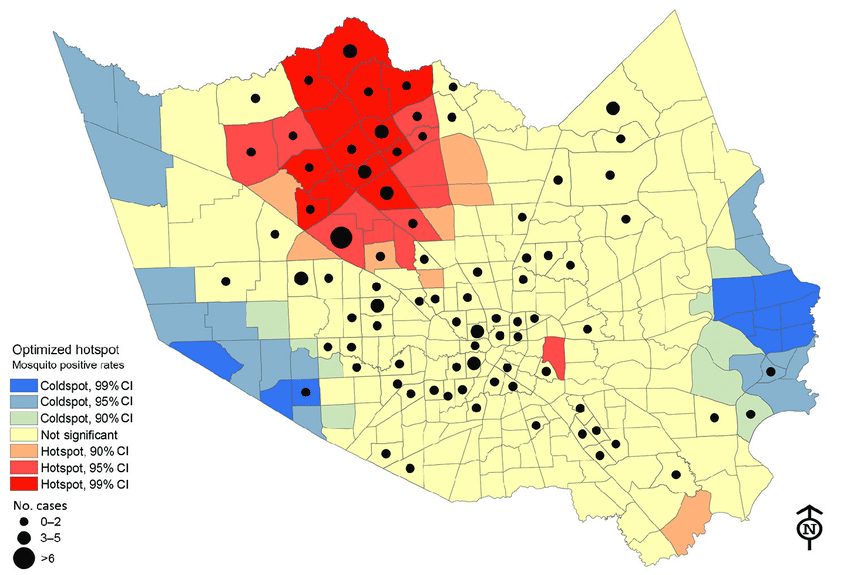
We’ve all heard about heatmaps in a typical GIS class. Heatmaps are maps that show the geographical clustering of a particular phenomenon. Do not confuse heatmaps with hot spot maps, which show statistical differences between areas. For example, areas with higher clustering of a phenomenon are hotspots and their inverse are cold spots. Hot spot analysis maps are more objective than heatmaps. But don’t they sound like they do the same thing? Almost, but not entirely. See below for differences between a heatmap and a hotspot analysis map.
Think of a heat map as an aesthetic visual aid that brings out the conglomeration of a particular phenomenon in place(s) more starkly. Also, heatmaps are useful when you want to identify patterns and correlations within large sets of data, and when you want to communicate this information to others in an easily understandable way.
When to use heatmaps?
Heatmaps are used in various cases, including:
- Data visualization: Heatmaps make it easy to identify patterns and trends by visually representing data.
- Website analytics: Heatmaps can analyze website traffic by showing where users are clicking, scrolling, and spending the most time.
- Geographic information systems: Heatmaps display data on a map, such as population density, crime rates, or temperature data.
- Medical research: Heatmaps can display data from medical imaging studies, such as fMRI data, to identify patterns and correlations.
- Sports analysis: Heatmaps can analyze player performance and movement on a field or court.
- Business analysis: Heatmaps can help in business intelligence and data analytics to understand consumer behaviour, identify sales trends, and more
Today, we shall plot heatmaps in R. This could be a continuation of the web map we created in R some time back. But, you can also start afresh. Remembering that it’s just a few years after the global spread of COVID-19, and in the same month it was discovered, what better way to create a heatmap of COVID-19 cases? More than that, no other disease has had more heatmaps drawn about it other than COVID. Why then, can we not create one too?
The data for the COVID-19 cases is available here. We have a dataset for COVID-19 cases recorded in the USA in 2022. Doctor’s normally psyche each other up by saying,
“Let’s put on our surgical gloves.”
Programmers don’t talk much but they can be equally good at bringing motivation. An equal statement would be:
“Let’s put our hoodies on and code a bit.”
Accessing the COVID-19 data
As you may have known by now, special (and specific) libraries are needed to carry out just any operation in R. By now you already know the key tools we need for spatial operations. Let’s unpack them.
# Call the needed spatial libraries
library(sf)
## Warning: package 'sf' was built under R version 4.2.2
## Linking to GEOS 3.9.3, GDAL 3.5.2, PROJ 8.2.1; sf_use_s2() is TRUE
library(sp)
## Warning: package 'sp' was built under R version 4.2.2
library(rgdal)
## Please note that rgdal will be retired by the end of 2023,
## plan transition to sf/stars/terra functions using GDAL and PROJ
## at your earliest convenience.
##
## rgdal: version: 1.5-32, (SVN revision 1176)
## Geospatial Data Abstraction Library extensions to R successfully loaded
## Loaded GDAL runtime: GDAL 3.4.3, released 2022/04/22
## Path to GDAL shared files: C:/Users/gachuhi/AppData/Local/R/win-library/4.2/rgdal/gdal
## GDAL binary built with GEOS: TRUE
## Loaded PROJ runtime: Rel. 7.2.1, January 1st, 2021, [PJ_VERSION: 721]
## Path to PROJ shared files: C:/Users/gachuhi/AppData/Local/R/win-library/4.2/rgdal/proj
## PROJ CDN enabled: FALSE
## Linking to sp version:1.5-0
## To mute warnings of possible GDAL/OSR exportToProj4() degradation,
## use options("rgdal_show_exportToProj4_warnings"="none") before loading sp or rgdal.
library(rgeos)
## rgeos version: 0.5-9, (SVN revision 684)
##  GEOS runtime version: 3.9.1-CAPI-1.14.2
##  Please note that rgeos will be retired by the end of 2023,
## plan transition to sf functions using GEOS at your earliest convenience.
##  GEOS using OverlayNG
##  Linking to sp version: 1.5-0
##  Polygon checking: TRUE
library(leaflet)
library(ggplot2)
## Warning: package 'ggplot2' was built under R version 4.2.2
Assuming you have already extracted the zip file we downloaded earlier on, let’s call the shapefile from the extracted folder into R. Just copy the filepath and parse it into the readOGR function as below.
# Call the shapefile into R
covid_data <- readOGR(dsn = "E:/documents/gis800_articles/hotspot/COVID-19_Cases_US/COVID-19_Cases_US.shp")
## OGR data source with driver: ESRI Shapefile
## Source: "E:\documents\gis800_articles\hotspot\COVID-19_Cases_US\COVID-19_Cases_US.shp", layer: "COVID-19_Cases_US"
## with 3241 features
## It has 18 fields
## Warning in readOGR(dsn = "E:/documents/gis800_articles/hotspot/
## COVID-19_Cases_US/COVID-19_Cases_US.shp"): Dropping null geometries: 93, 181,
## 243, 308, 319, 324, 388, 503, 538, 559, 675, 695, 887, 1117, 1181, 1204, 1244,
## 1270, 1302, 1318, 1328, 1411, 1762, 1784, 1797, 1817, 1851, 1910, 2230, 2266,
## 2395, 2412, 2424, 2604, 2624, 2864, 2900, 2915, 3086
Let’s find out the number of rows that our shapefile has. When reading shapefiles in R, the convention is to append @data to the shapefile name. This is used to read the shapefile data. However, even if it’s missing, R will still be able to read the shapefile.
# View number of rows of the covid-19 dataset
nrow(covid_data@data)
# View number of rows of the covid-19 dataset
nrow(covid_data@data)
## [1] 3202
Let’s investigate the attributes of our shapefile.
# View the Covid data
head(covid_data@data)
##   OBJECTID Province_S Country_Re Last_Updat      Lat     Long_ Confirmed
## 1        1    Alabama         US 2022/11/11 32.53953 -86.64408     18571
## 2        2    Alabama         US 2022/11/11 30.72775 -87.72207     66213
## 3        3    Alabama         US 2022/11/11 31.86826 -85.38713      6950
## 4        4    Alabama         US 2022/11/11 32.99642 -87.12511      7604
## 5        5    Alabama         US 2022/11/11 33.98211 -86.56791     17386
## 6        6    Alabama         US 2022/11/11 32.10031 -85.71266      2845
##   Recovered Deaths Active  Admin2  FIPS           Combined_K Incident_R
## 1      <NA>    229   <NA> Autauga 01001 Autauga, Alabama, US   33240.26
## 2      <NA>    716   <NA> Baldwin 01003 Baldwin, Alabama, US   29660.80
## 3      <NA>    103   <NA> Barbour 01005 Barbour, Alabama, US   28153.61
## 4      <NA>    108   <NA>    Bibb 01007    Bibb, Alabama, US   33955.52
## 5      <NA>    258   <NA>  Blount 01009  Blount, Alabama, US   30066.06
## 6      <NA>     54   <NA> Bullock 01011 Bullock, Alabama, US   28165.53
##   People_Tes People_Hos      UID ISO3
## 1       <NA>       <NA> 84001001  USA
## 2       <NA>       <NA> 84001003  USA
## 3       <NA>       <NA> 84001005  USA
## 4       <NA>       <NA> 84001007  USA
## 5       <NA>       <NA> 84001009  USA
## 6       <NA>       <NA> 84001011  USA
We can see the column headers of our shapefile attribute table all right. However, let’s list these column headers down for record purposes.
# View the covid_data column headers
names(covid_data@data)
##  [1] "OBJECTID"   "Province_S" "Country_Re" "Last_Updat" "Lat"
##  [6] "Long_"      "Confirmed"  "Recovered"  "Deaths"     "Active"
## [11] "Admin2"     "FIPS"       "Combined_K" "Incident_R" "People_Tes"
## [16] "People_Hos" "UID"        "ISO3"
Wait, the source of our data mentioned that the data was for both USA and Canada. Is that so? The unique function will duly answer this for us.
# View unique names in column of Country_Re header
unique(covid_data@data$Country_Re)
## [1] "US"
It’s only data for the USA.
Remember we had mentioned we are only interested in the column “Confirmed”. This column shows the confirmed COVID-19 cases at a particular place, say “Provinces” as in our case. Let’s investigate the univariate statistics within this column to get some meaning from the figures found in this column.
# Get univariate statistics of "Confirmed" column
summary(covid_data@data$Confirmed)
##    Min. 1st Qu.  Median    Mean 3rd Qu.    Max.
##      33    3083    7762   30354   20090 3500252
From our above statistics, the lowest number of COVID-19 confirmed cases at a particular place was 33 and the highest was 3500252. Just which were these areas? The [Statology site] (https://www.statology.org/r-select-rows-by-condition/) displays a method to select dataframe (df) rows by condition. That is – df[df$var1 == ‘value’, ]. However, our dataset is a shapefile, not a dataframe. Let’s see how this will work out.
All we have to do is replace df with the name of our shapefile dataset–covid_data.
# Get row with lowest value of 33
covid_data[covid_data@data$Confirmed == 33, ]
##               coordinates OBJECTID Province_S Country_Re Last_Updat      Lat
## 1655 (-101.696, 41.56896)     1696   Nebraska         US 2022/11/11 41.56896
##         Long_ Confirmed Recovered Deaths Active Admin2  FIPS
## 1655 -101.696        33      <NA>      1   <NA> Arthur 31005
##                Combined_K Incident_R People_Tes People_Hos      UID ISO3
## 1655 Arthur, Nebraska, US    7127.43       <NA>       <NA> 84031005  USA
# Get row with the highest value of 3500252
covid_data[covid_data@data$Confirmed == 3500252, ]
##               coordinates OBJECTID Province_S Country_Re Last_Updat      Lat
## 204 (-118.2282, 34.30828)      212 California         US 2022/11/11 34.30828
##         Long_ Confirmed Recovered Deaths Active      Admin2  FIPS
## 204 -118.2282   3500252      <NA>  34032   <NA> Los Angeles 06037
##                      Combined_K Incident_R People_Tes People_Hos      UID ISO3
## 204 Los Angeles, California, US   34866.17       <NA>       <NA> 84006037  USA
Handling data with over 3000 rows beats the sense of having a clean dataset. Since we have already seen that the mean of our confirmed COVID-19 cases is 30354, let’s only select those areas that are equal to and/or above this threshold. We shall save the areas meeting this threshold into a new dataset called covid_num.
# Get only those rows in the covid_data shapefile whose confirmed cases are above mean 30, 354
covid_num <- covid_data[covid_data$Confirmed >= 30354, ]
Let’s see how many rows we will now work with.
# Number of rows of covid_num
nrow(covid_num@data)
## [1] 581
This number of rows is fair enough to work with.
We want to overlay our COVID-19 cases over the territory from which this data was derived – the USA. To get the territory into R, you may think of going to Google and downloading a shapefile of USA, extracting it and loading it into R. Good enough, but not smart enough. R provides a package known as rnaturalearth and rnaturalearthdata which contains all of the world’s territorial boundaries in vector form. Additionally, the country data can be extracted at whatever scale you wish. Install the above packages using the function `install.packages(“packagename”) and call them into R.
# World data shapefiles
library(rnaturalearth)
## Warning: package 'rnaturalearth' was built under R version 4.2.2
library(rnaturalearthdata)
## Warning: package 'rnaturalearthdata' was built under R version 4.2.2
Our interest was USA, so,
# Extract the boundaries and extent of USA
usa <- ne_countries(scale = "medium", type = "countries", continent = "north america",
                    country = "united states of america", returnclass = "sp")
Using Leaflet JS, let’s briefly understand how COVID-19 cases were distributed in the conterminous USA in 2022.
# define colors based on rows of covid_num dataset
myColors = heat.colors(nrow(covid_num))

# Draw map of covid cases in USA using leaflet
leaflet(data = covid_num) %>%
  addTiles() %>%
  fitBounds(usa, lng1 = -125, lat1 = 24, lng2 = -67, lat2 = 50) %>%
  addCircleMarkers(data = covid_num, lng = ~Long_, lat = ~Lat, radius = ~Confirmed/100000,
                   color = myColors, fillColor = ~Confirmed) # fillColor will be based on myColors but dependent on numbers of "Confirmed" cases
Plotting the heatmap
Two draw the heatmap, we will need two more packages. These are ggmap and RColorbrewer.
# Additional libraries
library(ggmap)
## Warning: package 'ggmap' was built under R version 4.2.2
## ℹ Google's Terms of Service: <]8;;https://mapsplatform.google.comhttps://mapsplatform.google.com]8;;>
## ℹ Please cite ggmap if you use it! Use `citation("ggmap")` for details.
library(RColorBrewer)
We want to get a static web map tile layer which will act as our basemap, compared to the live web map we have used in Leaflet. Why a static map? Because the forthcoming operations of creating a heatmap will be dependent on ggplot and ggmap, which act on static, rather than live, web-based maps.
The most commonly used function to get a static web map tile layer is get_map. However, it needs a Google API key, which requires you to sign in, insert your card number, yaddah yaddah, and we don’t wanna complicate life in the name of plotting a simple heatmap. So what’s the workaround?
We will use get_stamen, thanks to this coder.
# Access static get_stamen tile layer
covid_map <- get_stamenmap(bbox = c(-125, 24, -67, 50), zoom = 5, maptype = "toner-lite") # the maptype does the magic of choosing the most appealing basemap. Experiment!
## ℹ Map tiles by Stamen Design, under CC BY 3.0. Data by OpenStreetMap, under ODbL.
# How does covid_map look?
covid_map
## 755x1319 toner-lite map image from Stamen Maps; use `]8;;ide:help:ggmap::ggmapggmap::ggmap]8;;()` to plot
## it.
Whoops! No map is drawn.
This is where ggmap comes in. ggmap plots the raster object produced by get_map(). Alright. Map it.
# Use ggmap to plot the Stamen Map - covid_map
covid_map2 <- ggmap(covid_map, extent = "device", legend = "none")
covid_map2
Cool map. Who said grey was a dull colour?
Let’s get going quickly. ggplot only works with dataframes, and not shapefiles. Therefore, let’s convert our covid_num shapefile into a dataframe to feed into ggplot.
# Convert shapefile into dataframe
covid_num2 <- as.data.frame(covid_num)
head(covid_num2)
##    OBJECTID Province_S Country_Re Last_Updat      Lat     Long_ Confirmed
## 2         2    Alabama         US 2022/11/11 30.72775 -87.72207     66213
## 8         8    Alabama         US 2022/11/11 33.77484 -85.82630     38716
## 28       28    Alabama         US 2022/11/11 34.04567 -86.04052     32619
## 35       35    Alabama         US 2022/11/11 31.15198 -85.29940     30565
## 37       37    Alabama         US 2022/11/11 33.55555 -86.89506    221687
## 41       41    Alabama         US 2022/11/11 32.60155 -85.35132     44471
##    Recovered Deaths Active    Admin2  FIPS             Combined_K Incident_R
## 2       <NA>    716   <NA>   Baldwin 01003   Baldwin, Alabama, US   29660.80
## 8       <NA>    661   <NA>   Calhoun 01015   Calhoun, Alabama, US   34079.49
## 28      <NA>    684   <NA>    Etowah 01055    Etowah, Alabama, US   31895.61
## 35      <NA>    526   <NA>   Houston 01069   Houston, Alabama, US   28867.04
## 37      <NA>   2480   <NA> Jefferson 01073 Jefferson, Alabama, US   33661.72
## 41      <NA>    359   <NA>       Lee 01081       Lee, Alabama, US   27027.14
##    People_Tes People_Hos      UID ISO3 coords.x1 coords.x2
## 2        <NA>       <NA> 84001003  USA -87.72207  30.72775
## 8        <NA>       <NA> 84001015  USA -85.82630  33.77484
## 28       <NA>       <NA> 84001055  USA -86.04052  34.04567
## 35       <NA>       <NA> 84001069  USA -85.29940  31.15198
## 37       <NA>       <NA> 84001073  USA -86.89506  33.55555
## 41       <NA>       <NA> 84001081  USA -85.35132  32.60155
If you wish, you can check if California really had the highest recorded number of COVID-19 cases at 3500252. In my case, it still holds the trophy.
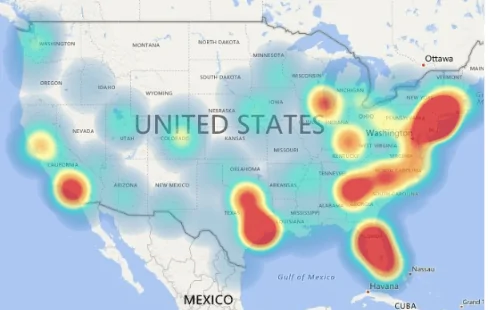
For our heatmap, we shall plot it using the stat_density_2d function of ggplot. The stat_density_2d function of ggplot uses kernel density estimation to create a heatmap. Kernel Density Estimation, otherwise abbreviated as KDE, is a useful but difficult concept to explain off the hook. For further reading, see this article. Time to plot the heatmap.
# Plot the heatmap
covid_map3 <- covid_map2 +
  stat_density_2d(
    data = covid_num2,
    aes(
      x = Long_,
      y = Lat,
      fill = ..level..,
      alpha = ..level..
      ),
    geom = "polygon",
    na.rm = F,
    ) +
  scale_fill_gradientn(
    colours = rev(
      brewer.pal(7, "Spectral")
      )
    )

covid_map3
## Warning: The dot-dot notation (`..level..`) was deprecated in ggplot2 3.4.0.
## ℹ Please use `after_stat(level)` instead.
## ℹ The deprecated feature was likely used in the ggmap package.
##   Please report the issue at <]8;;https://github.com/dkahle/ggmap/issueshttps://github.com/dkahle/ggmap/issues]8;;>.
## Warning: Removed 11 rows containing non-finite values (`stat_density2d()`).
Results
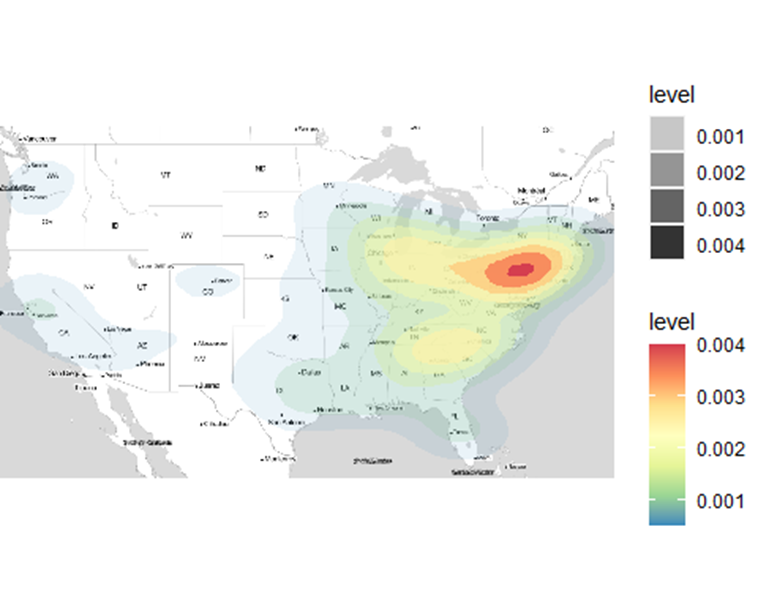
What just happened? What we simply did was call our data – covid_num2 into the stat_density_2d function. The x and y fields were filled with our longitude (Long_) and latitude (Lat) fields of covid_num2 respectively. How about fill, alpha and geom parameters?
What was their contribution to the plotted heatmap above?
According to this article, the “..level..” value commands the fill and alpha parameters to automatically create a differentiated colour scheme and transparency level respectively based on the number of points conglomerating at a certain place. Unfortunately, the heatmap is based on the distribution of points in a geographic surface other than the values inherent per point, such as the number of confirmed cases in each location. The latter would have been a more interesting phenomenon to analyse. geom simply states how we want to display the density zones. Just remove the geom parameter, or change it to points and see the difference. Do the results look pointless?
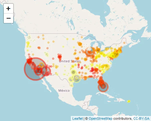
Let’s add more credibility and finalize our heatmap by overlaying it with our COVID-19 cases. One thing to note though, you can’t add a ggplot() to another ggplot(). R will throughout an error.
# Overlay the Covid-19 cases
covid_map4 <- covid_map3 +
  geom_point(
    data = covid_num2,
    aes(
      x = Long_,
      y = Lat
      ),
    fill = "steelblue",
    shape = 21,
    size = covid_num2$Confirmed/100000,
    alpha = 0.5,
    )
covid_map4
## Warning: Removed 11 rows containing non-finite values (`stat_density2d()`).
## Warning: Removed 11 rows containing missing values (`geom_point()`).
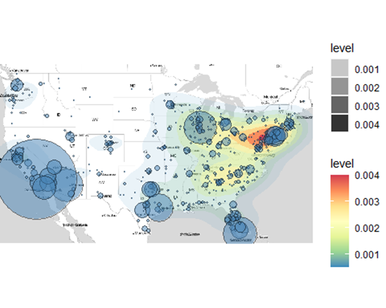
The sizes of the bubbles show the number of confirmed COVID-19 cases at that particular location. Small bubbles represent fewer confirmed cases and larger bubbles and vice versa. The underlying heatmap shows the density of confirmed cases cast out in the form of a heatmap.
Conclusion
Heatmaps are a great way of visualizing information and enable one to make a conclusive judgement about a matter without the involvement of many studies. In this exercise, you learned how to create a hotspot map using Leaflet. After that, we created a heatmap by following a series of steps that involved get_stamen, ggmap and ggplot. Our final map was a combination of a heatmap and a hotspot map, thus providing a plethora of information not just on the density of cases (the underlying heatmap), but also on the quantity of the confirmed cases per location as the bubblesizes show (the overlying bubbles). Heatmaps are easy to understand, but making them is far from easy. You end up feeling the heat. Like you did here.


Create Heatmaps in R