Color blind maps are maps that are designed to be legible for people with color vision deficiencies. These maps use color schemes that are less likely to cause confusion for people with color blindness and may include additional visual elements such as patterns or textures to help distinguish different features on the map. They can also make use of color-coding systems that are based on shapes, rather than colors, to represent different features.
We are living in an era of digital maps. We’ve evolved from static maps to dynamic maps where different formats(icons, pictures) of information are being developed and shared by a large group of people globally.
When mapping, less often do we consider making color blind maps. How do you paint a picture or develop a map when the color blind is waiting to see the results?
There are several benefits to creating color blind maps:
- Improved accessibility: Color blind maps make maps more accessible to people with color vision deficiencies, allowing them to better understand and use the information presented on the map.
- Increased readability: Color blind maps use color schemes that are more easily distinguishable for people with color vision deficiencies, making the maps more legible and easier to use.
- Greater usability: These maps often include additional visual elements such as patterns or textures to help distinguish different features on the map, making them more usable for a wider range of people.
- Better data representation: The maps can also use color-coding systems that are based on shapes, rather than colors, to represent different features, resulting in a more accurate representation of data.
- Greater inclusivity: By creating color blind maps, organizations can demonstrate their commitment to inclusivity and accessibility, and reach a wider audience.
- Better decision-making: These maps enable better decision-making by providing accurate and easy-to-understand visual information to all users.
How to make color blind maps
QGIS has the “Preview Mode” (Simulate Color Blindness (Protanope/Deuteranope)) which helps GIS Analysts to create maps that will be perceived by all.
To use it, Go to View Menu > Preview Mode and select the mode you require. The different modes are as shown below;
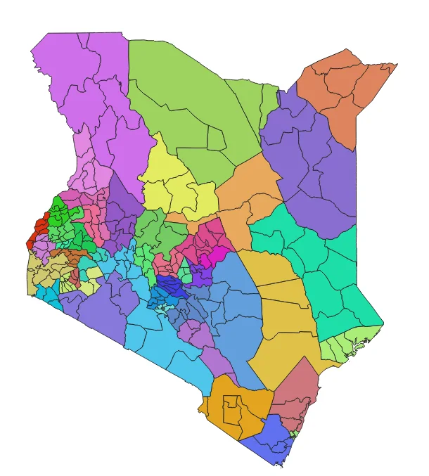
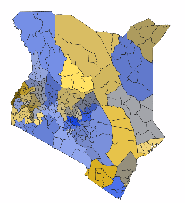
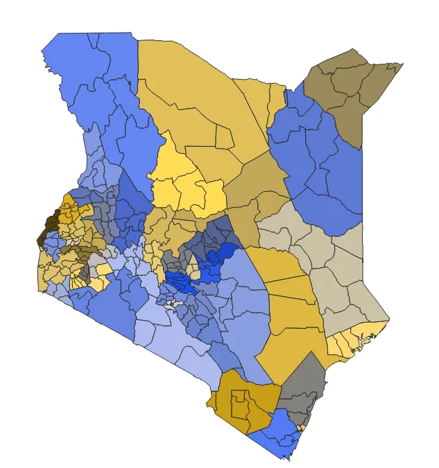
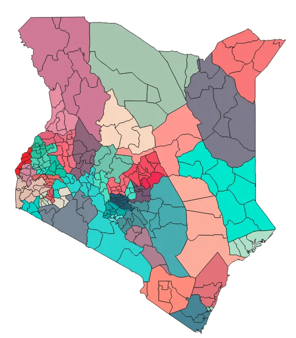
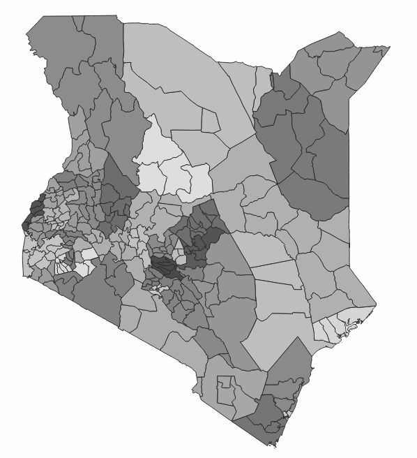
As in the maps above, different views can be seen and just like that, we happily created maps which can be perceived by all.


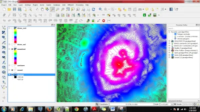
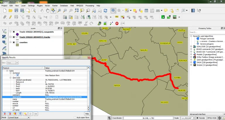
Color Blind Maps in QGIS